Serif vs Sans Serif Fonts: When to Use Each is one of the most important topics to understand when creating a memorable and successful brand identity. The fonts you choose influence how people perceive your business, communicate your brand personality, and improve readability across print and digital platforms. Whether you’re designing a logo, building a website, or developing marketing materials, choosing between serif and sans serif fonts can make a significant impact. In this guide, you’ll learn the key differences between serif and sans serif fonts, when to use each style, and practical typography tips to create a professional, cohesive, and visually appealing brand.
Serif vs Sans Serif Fonts: When to Use Each for Better Design and Branding
Typography is one of the most powerful tools in graphic design, yet it’s often overlooked. The fonts you choose can influence how people perceive your brand, affect readability, and even impact conversion rates.
If you’ve ever wondered about Serif vs Sans Serif Fonts: When to Use Each, you’re not alone. Designers, marketers, business owners, and content creators frequently face this decision when building websites, logos, advertisements, and brand identities.
Understanding Serif vs Sans Serif Fonts: When to Use Each can help you create designs that not only look professional but also communicate the right message to your audience.
In this guide, we’ll explore the differences between serif and sans serif fonts, when to use each, their strengths and weaknesses, and how top brands use typography to build memorable identities.
What Are Serif vs Sans Serif Fonts: When to Use Each?
Before deciding which font style is right for your project, it’s important to understand the difference.
Serif vs Sans Serif Fonts: What Is a Serif Font?
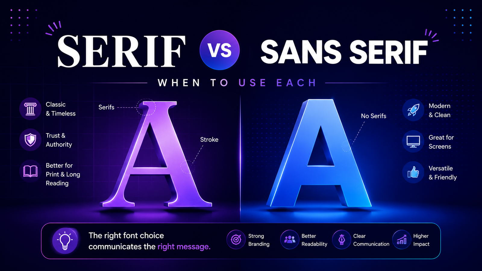
A serif font includes small decorative strokes or “feet” at the ends of letters.
Examples include:
- Times New Roman
- Garamond
- Baskerville
- Georgia
- Merriweather
Serif fonts have been used for centuries and are often associated with tradition, authority, and trustworthiness.
Characteristics of Serif Fonts
- Classic appearance
- Formal tone
- Strong readability in print
- Professional and authoritative feel
Serif vs Sans Serif Fonts: What Is a Sans Serif Font?
The term “sans” means “without.”
Sans serif fonts do not have decorative strokes at the ends of letters.
Popular examples include:
- Helvetica
- Arial
- Futura
- Montserrat
- Poppins
- Inter
Characteristics of Sans Serif Fonts
- Minimalist look
- Modern feel
- Excellent digital readability
- Versatile design applications
Serif vs Sans Serif Fonts: When to Use Each in Branding
Brand perception is heavily influenced by typography.
Different font styles communicate different emotions and personality traits.
When to Use Serif Fonts in Branding?
Serif fonts work best when brands want to communicate:
- Trust
- Heritage
- Luxury
- Sophistication
- Authority
Real-World Examples of Serif Branding
Vogue
Vogue uses elegant serif typography to reinforce luxury and fashion authority.
Rolex
Rolex leverages serif letterforms to communicate prestige and craftsmanship.
The New York Times
The publication uses serif typography to emphasize credibility and tradition.
Best Industries for Serif Fonts
- Luxury brands
- Law firms
- Finance
- Publishing
- Education
- High-end fashion
When to Use Sans Serif Fonts in Branding?
Sans serif fonts are ideal for brands seeking a modern, approachable identity.
Real-World Examples of Sans Serif Branding
Google’s logo redesign introduced a clean sans serif typeface to improve accessibility and digital usability.
Spotify
Spotify uses sans serif typography to create a friendly and contemporary experience.
Airbnb
Airbnb combines simplicity and warmth through modern sans serif branding.
Best Industries for Sans Serif Fonts
- Technology
- Startups
- SaaS companies
- E-commerce
- Mobile apps
- Digital services
Serif vs Sans Serif Fonts: When to Use Each for Websites
Website typography directly affects user experience and readability.
When to Use Serif Fonts on Websites?
Modern high-resolution screens have made serif fonts more web-friendly.
Use serif fonts for:
- Editorial websites
- Blogs
- Online magazines
- Luxury websites
- Long-form reading experiences
Popular Web Serif Fonts
- Merriweather
- Playfair Display
- Lora
- Cormorant Garamond
When to Use Sans Serif Fonts on Websites?
Sans serif fonts continue to dominate web design because of their clean appearance and readability.
Use sans serif fonts for:
- Landing pages
- SaaS websites
- Mobile-first websites
- Dashboards
- User interfaces
Popular Web Sans Serif Fonts
- Inter
- Poppins
- Montserrat
- Open Sans
- Nunito
For typography inspiration: https://fonts.google.com
Serif vs Sans Serif Fonts: When to Use Each in Logo Design
Typography is often the centerpiece of a logo.
The font choice instantly influences brand perception.
Serif Fonts in Logo Design
Serif logos communicate:
- Luxury
- Heritage
- Trust
- Elegance
Brands Using Serif Logos
- Vogue
- Tiffany & Co.
- Harper’s Bazaar
Best Use Cases
- Premium brands
- Fashion labels
- Boutique businesses
- Luxury services
Sans Serif Fonts in Logo Design
Sans serif logos communicate:
- Innovation
- Simplicity
- Accessibility
- Modernity
Brands Using Sans Serif Logos
- Netflix
- Uber
- Airbnb
Best Use Cases
- Technology brands
- Startups
- Digital products
- Modern service companies
For logo inspiration: https://www.pentagram.com/work/pentagram-marks/story
Serif vs Sans Serif Fonts: When to Use Each for Readability
Readability remains one of the most important factors when selecting typography.
Are Serif Fonts More Readable?
Historically, serif fonts were considered easier to read in print because the decorative strokes helped guide the eye across lines of text.
They remain excellent for:
- Books
- Newspapers
- Magazines
- Printed reports
Are Sans Serif Fonts More Readable?
On screens, sans serif fonts often perform better due to their cleaner structure.
They’re ideal for:
- Mobile devices
- User interfaces
- Websites
- Digital dashboards
Practical Rule
Print = Serif often wins.
Digital = Sans serif often wins.
Serif vs Sans Serif Fonts: When to Use Each Based on Font Psychology
Typography influences emotions more than many designers realize.
Serif Font Psychology
Serif fonts often communicate:
- Trustworthiness
- Authority
- Reliability
- Tradition
- Expertise
Sans Serif Font Psychology
Sans serif fonts typically communicate:
- Innovation
- Simplicity
- Friendliness
- Efficiency
- Modernity
Understanding font psychology helps align typography with brand personality.
Serif vs Sans Serif Fonts: When to Use Each Together
One of the most effective typography strategies is combining both styles.
Popular Font Pairing Formula
Heading: Serif Font
Body Text: Sans Serif Font
Or
Heading: Sans Serif Font
Body Text: Serif Font
Examples
- Playfair Display + Montserrat
- Merriweather + Open Sans
- Lora + Inter
- Cormorant + Poppins
This combination creates visual contrast while maintaining readability.
For font pairing ideas: https://fontpair.co
Common Mistakes When Choosing Between Serif and Sans Serif Fonts
Avoid these typography mistakes:
Choosing Based on Trends Alone
Trendy fonts may become outdated quickly.
Using Too Many Fonts
Limit yourself to 2–3 typefaces.
Ignoring Readability
Always prioritize user experience.
Forgetting Brand Personality
Typography should reflect your brand’s values and audience.
Typography Trends for 2026
Several typography trends are shaping modern design:
- Variable fonts
- Custom typography
- Large display type
- Minimalist sans serif fonts
- Modern serif revival
- Responsive typography
- Accessible web typography
Interestingly, both serif and sans serif styles are thriving in 2026.
The winning choice depends on context rather than trends alone.
Frequently Asked Questions About Serif vs Sans Serif Fonts: When to Use Each
Which is better: serif or sans serif?
Neither is universally better. The right choice depends on your audience, platform, and brand personality.
Are serif fonts outdated?
Not at all. Serif fonts remain popular in luxury branding, publishing, and editorial design.
Why do tech companies prefer sans serif fonts?
Sans serif fonts feel modern, clean, and perform exceptionally well on digital screens.
Can I combine serif and sans serif fonts?
Yes. Pairing both styles is one of the most effective typography strategies.
What is the best font for websites?
Popular choices include Inter, Poppins, Open Sans, Merriweather, and Lora
Conclusion: Serif vs Sans Serif Fonts: When to Use Each
Understanding Serif vs Sans Serif Fonts: When to Use Each is essential for creating effective designs, memorable brands, and engaging user experiences.
Serif fonts excel when you want to communicate tradition, authority, elegance, and trust. Sans serif fonts are often the better choice when modernity, simplicity, and digital performance are priorities.
The most successful designers don’t ask which style is better—they ask which style is better for the specific audience and purpose.
As typography trends continue evolving in 2026, both serif and sans serif fonts remain valuable tools in every designer’s toolkit. By understanding their strengths, psychology, and applications, you’ll be able to make smarter design decisions and create stronger visual communication.
Remember: great typography isn’t about following rules—it’s about choosing the right font for the right message.