1. Introduction
Fonts are an integral part of the design world, wielding the power to shape perceptions, convey messages, and establish brand identities. With an abundance of font options available, understanding the different types, their distinctions, and how to effectively use them in logo design is essential for designers and businesses alike. In this comprehensive guide, we will embark on a journey through the captivating realm of fonts, exploring their diverse types, highlighting the differences between them, discussing their usability, and unveiling the art of incorporating them into compelling logo designs.
Fonts are more than just the letters we see on a screen or page; they are the visual embodiment of the written word. Every font possesses its own unique personality, evoking emotions and resonating with audiences in different ways. From the elegant serifs that exude tradition and sophistication to the sleek sans-serifs that communicate modernity and simplicity, fonts can speak volumes without uttering a single word.
In this digital age, where visual communication is paramount, selecting the right font has become a crucial aspect of design. Fonts can establish a visual hierarchy, enhance readability, and reflect a design piece’s intended tone and message. When it comes to logo design, fonts play a pivotal role in creating a strong brand identity, capturing attention, and leaving a lasting impression on viewers’ minds.
This guide will delve into the various font types, including serifs, sans-serifs, scripts, displays, moderns, and decorative fonts, unravelling their distinctive characteristics and exploring when and how to best utilize them. We will delve into the differences between these font types, providing insights into their unique traits and suitable applications. Additionally, we will delve into the practical considerations of font selection, such as legibility, emotional connotations, brand consistency, and target audience preferences.
Moreover, this guide will specifically focus on the art of incorporating fonts into logo design. We will uncover the secrets of selecting fonts that align with a brand’s identity and values, creating memorable and impactful logos. We will explore techniques for achieving the perfect balance between simplicity and uniqueness, as well as effectively pairing fonts for harmonious design compositions. Real-life case studies and examples will serve as sources of inspiration, offering practical insights into the successful integration of fonts in logo design.
So, whether you are a designer seeking to expand your font knowledge or a business owner striving to create a distinctive brand identity, this guide will equip you with the necessary understanding and tools to make informed font choices and unleash the full potential of fonts in your design endeavours. Get ready to embark on a typographic adventure, where fonts will come to life and transform your designs into captivating visual narratives.
2. Understanding Fonts:
In this section, we will explore the concept of fonts and their significance in design. We will delve into the following sub-points to provide a comprehensive understanding:
2.1 What are Fonts?
- Definition of fonts:
Fonts are collections of characters, symbols, and glyphs that share a consistent design style and are used to represent textual content. They encompass a set of visual elements that define how letters, numbers, punctuation marks, and other symbols appear. Fonts determine the shape, size, weight, and style of these characters, allowing them to convey specific messages and evoke certain emotions.
In the realm of design, fonts serve as a fundamental tool for visual communication. They enable designers to select and manipulate textual elements, influencing the overall look and feel of a design piece. Fonts play a crucial role in establishing visual hierarchy, enhancing readability, and conveying the intended tone and personality of a design.
In essence, fonts are the visual representation of written language, embodying various styles and characteristics that contribute to the aesthetics and effectiveness of design compositions. They have the power to capture attention, evoke emotions, and create a distinct visual identity for brands, making them an essential aspect of the design process.
- Role of fonts in design
The role of fonts in design is multifaceted and influential. Fonts play a crucial role in shaping the overall aesthetic, visual hierarchy, and readability of design compositions. Here are some key aspects of their role in design, along with examples:
- Establishing Visual Hierarchy: Fonts help establish a clear visual hierarchy by differentiating various levels of information. For example, using a bold and larger font for headings, a regular font for subheadings, and a smaller font for body text creates a hierarchy that guides the reader’s attention. This ensures that important information stands out and is easily distinguishable. For instance, in a magazine layout, a bold and decorative font for the main headline draws attention to the featured article, while a simpler font for supporting content maintains readability.
- Conveying Emotions and Tone: Fonts have the power to evoke specific emotions and set the tone for a design. Different font styles and characteristics can convey a range of emotions, such as elegance, playfulness, professionalism, or seriousness. For example, a whimsical and handwritten script font may be used in a children’s book cover to evoke a sense of fun and creativity, while a clean and minimal sans-serif font may be employed in a corporate brochure to communicate professionalism and clarity.
- Enhancing Readability: Fonts significantly impact the readability of text-based design elements. Selecting appropriate fonts with clear letterforms, balanced proportions, and appropriate spacing ensures that the text is easily legible and understandable for the intended audience. For instance, a sans-serif font with generous spacing between letters and moderate stroke thickness is often chosen for digital interfaces to enhance legibility on screens.
- Brand Representation: Fonts play a vital role in establishing and maintaining brand identities. Consistent use of specific fonts across various brand touchpoints helps create recognition and reinforces the brand’s visual identity. Famous examples include the use of the cursive Coca-Cola font, which has become instantly recognizable and synonymous with the brand, or the clean and modern font used by tech giant Apple, contributing to their sleek and sophisticated brand image.
By carefully selecting and utilizing fonts in design, designers can effectively communicate messages, evoke desired emotions, guide viewers’ attention, and strengthen brand identities. Fonts have the ability to transform design compositions, leaving a lasting impression on the audience.
3. Font Types
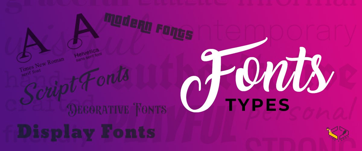
Font types refer to different categories or classifications of fonts based on their visual characteristics and design styles. Here are some common font types explained:
- Serif Fonts: Serif fonts are characterized by small decorative strokes, known as serifs, at the ends of letterforms. These fonts are often associated with a traditional, elegant, and formal aesthetic. Serif fonts are commonly used in print media such as books, newspapers, and formal documents. Examples of serif fonts include Times New Roman, Georgia, and Baskerville.
- Sans-Serif Fonts: Sans-serif fonts, as the name suggests, do not have serifs. They have clean and simple letterforms with straight lines and no embellishments. Sans-serif fonts are often considered modern, minimal, and easier to read on digital screens. They are widely used in web design, user interfaces, and contemporary branding. Popular sans-serif fonts include Arial, Helvetica, and Futura.
- Script Fonts: Script fonts mimic handwritten or calligraphic styles. They are characterized by flowing, connected, and often decorative letterforms. Script fonts can evoke a sense of elegance, creativity, and personal touch. They are commonly used in invitations, branding for luxury products, and artistic designs. Examples of script fonts include Brush Script, Lobster, and Pacifico.
- Display Fonts: Display fonts are attention-grabbing, decorative, and often unconventional. They are designed to make a statement and stand out in large sizes. Display fonts can have unique and artistic letterforms, making them suitable for headlines, logos, and creative designs. Examples of display fonts include Impact, Bebas Neue, and Lobster.
- Modern Fonts: Modern fonts, also known as geometric or neo-grotesque fonts, are characterized by clean lines, minimalistic designs, and a geometric structure. These fonts often have a more contemporary and futuristic appearance. Modern fonts are popular in digital designs, branding, and advertising. Examples of modern fonts include Gotham, Avenir, and Montserrat.
- Decorative Fonts: Decorative fonts encompass a wide range of font styles that are highly distinctive and often themed or stylized. These fonts can be ornamental, whimsical, grungy, or themed to match specific design concepts. Decorative fonts are used sparingly for creative projects, logos, or when a specific aesthetic or mood needs to be conveyed. Examples of decorative fonts include Blackletter, Comic Sans, and Ransom.
Each font type has its own unique characteristics and conveys a specific visual tone. By understanding the different font types, designers can make informed choices to enhance the overall aesthetic and effectively communicate the intended message in their design projects.
4. Differences between Font Types
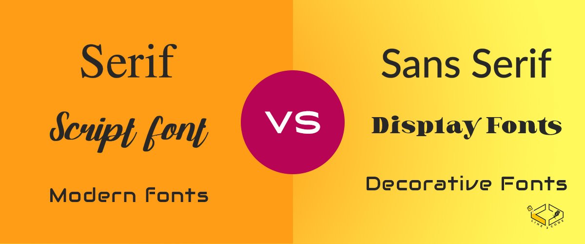
There are distinct differences between various font types, each with its own visual characteristics and intended applications. Here are the key differences between some commonly used font types:
- Serif vs. Sans-Serif Fonts: The primary difference lies in the presence or absence of serifs. Serif fonts have small decorative strokes at the ends of letterforms, while sans-serif fonts do not. Serif fonts are often associated with a traditional and formal aesthetic, while sans-serif fonts have a modern and minimalistic appearance. Serif fonts are commonly used in print media, such as books and newspapers, while sans-serif fonts are preferred for digital screens and interfaces.
- Script vs. Display Fonts: Script fonts and display fonts differ in their style and purpose. Script fonts mimic handwritten or calligraphic styles, featuring connected and flowing letterforms. They are often used to evoke elegance, personalization, or a sense of creativity. On the other hand, display fonts are attention-grabbing and decorative, designed to make a bold statement in large sizes. They can have unique and artistic letterforms, making them suitable for headlines, logos, and creative designs.
- Modern vs. Decorative Fonts: Modern fonts, also known as geometric or neo-grotesque fonts, have clean lines, minimalistic designs, and a geometric structure. They convey a contemporary and often futuristic appearance. Decorative fonts, on the other hand, encompass a wide range of styles that are highly distinctive and often themed or stylized. Decorative fonts can be ornamental, whimsical, grungy, or themed to match specific design concepts. They are used sparingly for creative projects or when a specific aesthetic or mood needs to be conveyed.
Understanding these differences enables designers to select the most appropriate font type for their specific design objectives. Factors such as the desired tone, target audience, medium, and overall visual style of the project should be considered when choosing between font types. The differences between font types allow for versatility and the ability to create designs that are tailored to specific needs and convey the intended message effectively.
5. Usability of Fonts
The usability of fonts refers to their practicality and effectiveness in various design contexts. It encompasses factors such as legibility, readability, versatility, and compatibility with different mediums. Here are the key aspects to consider when assessing the usability of fonts:
- Legibility: Legibility refers to how easily individual characters are distinguished from one another. A font with good legibility ensures that each letter is clear and recognizable, even at small sizes or in challenging reading conditions. Legible fonts are crucial for ensuring that the audience can read and understand the text without strain or confusion.
- Readability: Readability goes beyond legibility and considers how comfortable and enjoyable it is to read longer passages of text. Fonts with high readability feature well-designed letterforms, appropriate spacing, and suitable proportions between characters. They facilitate smooth and effortless reading experiences, allowing the audience to absorb the content without unnecessary effort.
- Versatility: Versatile fonts are those that can adapt to different design contexts and convey various moods or tones effectively. They are suitable for a wide range of applications, from body text in articles to bold headlines in advertisements. Versatile fonts have multiple weights, styles, and variations, allowing designers to use them in different design elements while maintaining consistency.
- Medium Compatibility: Fonts need to be compatible with the medium in which they will be used. Certain fonts are better suited for print, while others are optimized for digital screens or specific software. Consideration should be given to factors such as resolution, hinting, and anti-aliasing to ensure optimal rendering and clarity of the font in the intended medium.
- Accessibility: Fonts should be accessible to a diverse audience, including individuals with visual impairments or reading difficulties. Accessibility considerations involve selecting fonts that have good contrast between the characters and the background, using appropriate font sizes, and ensuring compatibility with assistive technologies.
When evaluating the usability of fonts, it is crucial to consider the specific requirements of the design project, the target audience, and the intended medium. A font that is highly usable will enhance the overall user experience, effectively communicate the intended message, and contribute to the success of the design.
6. Using Fonts in Logo Design
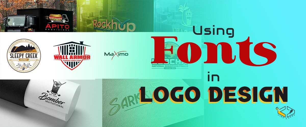
Typography plays a crucial role in logo design, as it helps communicate the brand’s identity, establish memorability, balance simplicity and uniqueness, and create visual harmony. Let’s delve into the key aspects of using fonts in logo design:
- Reflecting Brand Identity: Fonts contribute significantly to expressing a brand’s identity and personality. Different font styles evoke distinct emotions and convey specific messages. For instance, a bold and modern sans-serif font may be used to portray a sense of strength and innovation, while a sophisticated script font can communicate elegance and luxury. Selecting a font that aligns with the brand’s values and resonates with the target audience helps create a strong visual representation of the brand’s identity.
- Achieving Memorability: Memorability is a crucial factor in logo design, as it aims to leave a lasting impression on viewers. Fonts can contribute to the memorability of a logo by using unique and distinctive letterforms. Custom lettering or fonts with uncommon characteristics can help create a memorable logo that stands out from the competition. The font choice should capture the essence of the brand while ensuring the logo remains easily recognizable and memorable across different mediums and sizes.
- Balancing Simplicity and Uniqueness: A successful logo strikes a balance between simplicity and uniqueness. The font used in a logo should be simple enough to be easily recognizable and scalable, ensuring clarity and legibility across various sizes and applications. At the same time, it should have a unique touch that sets the logo apart from others in the market. Fonts with subtle modifications or custom lettering can add a distinctive element to the logo while maintaining its simplicity and functionality.
- Pairing Fonts: In some logo designs, multiple fonts are used to create visual interest and establish hierarchy. Choosing complementary fonts that work harmoniously together is essential. Fonts should complement each other in terms of style, weight, and proportion. Pairing a bold, attention-grabbing font with a clean and simple font for taglines or secondary text can create a visually appealing logo that captures attention and conveys information effectively.
- Case Studies and Examples: Case studies and examples provide real-world insights into how fonts are used in successful logo designs. Analyzing and studying existing logos can inspire designers and help them understand how different fonts contribute to the overall design. Examining successful logo designs across various industries can provide valuable lessons in font selection, pairing, and usage, offering practical guidance for designers.
By considering these key aspects and incorporating appropriate fonts, designers can create impactful and visually appealing logos that effectively represent the brand, capture attention, and leave a lasting impression on the audience.
7. TrueType vs. OpenType Fonts
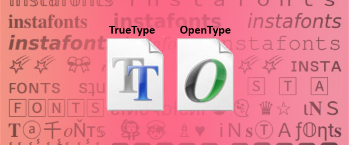
In the world of digital typography, two popular font formats are TrueType and OpenType. These formats have their own characteristics, capabilities, and advantages. Let’s explore the differences between TrueType and OpenType fonts and their respective features:
What is TrueType?
TrueType is a font format developed by Apple and Microsoft in the 1980s. It was created as a replacement for the older bitmap fonts and aimed to provide high-quality scalable fonts for both screen and print. TrueType fonts use quadratic Bézier curves to define the outlines of each character, ensuring smooth and accurate rendering on various devices and resolutions.
What is OpenType?
OpenType is a font format introduced by Microsoft and Adobe in the late 1990s. It is an extension of the TrueType format with additional capabilities. OpenType fonts can contain a vast range of characters, including multilingual support, ligatures, stylistic alternates, and a wide variety of glyphs. The format utilizes either TrueType or PostScript outlines, making it compatible with both Mac and Windows operating systems.
Differences and Advantages:
The primary differences and advantages of TrueType and OpenType fonts are as follows:
- Glyph Support: OpenType fonts have more extensive glyph support compared to TrueType. They can include thousands of characters, covering multiple languages, special symbols, ligatures, and typographic variations. This makes OpenType fonts more versatile and suitable for complex typographic projects.
- Layout Features: OpenType fonts support advanced typographic features, such as ligatures, small caps, contextual alternates, swashes, and stylistic sets. These features allow designers to add more visual variety and artistic flair to their typography. TrueType fonts, while capable of some basic typographic variations, have limited support for advanced layout features.
- Cross-Platform Compatibility: OpenType fonts are more cross-platform compatible than TrueType fonts. They can be used on both Mac and Windows systems without any issues. TrueType fonts, although widely supported, may encounter compatibility problems when moving between different operating systems.
- File Size: TrueType fonts tend to have smaller file sizes compared to OpenType fonts. This can be beneficial when file size optimization is a priority, particularly for web-based projects where faster loading times are crucial. OpenType fonts, with their broader range of features and glyph support, often result in larger file sizes.
- Modern Standards: OpenType is a more recent format and has become the industry standard for professional typography. Many contemporary fonts are exclusively available in OpenType format, offering the latest typographic advancements and features. TrueType fonts, while still widely used and supported, may not have the same level of modern features and support as OpenType.
Understanding the differences between TrueType and OpenType fonts helps designers make informed decisions when selecting fonts for their projects. While TrueType fonts offer simplicity and compatibility, OpenType fonts provide expanded glyph support, advanced layout features, and cross-platform compatibility. The choice between the two formats depends on the specific requirements of the project and the desired typographic capabilities.
8. Frequently Asked Questions (FAQs):
Here are answers to some commonly asked questions about fonts and their usage:
Choosing the right font for your design involves considering factors such as the design context, target audience, and brand identity. Start by understanding the message you want to convey and the emotions you want to evoke. Consider the overall aesthetics, legibility, and compatibility with the medium. Experiment with different font styles, weights, and combinations to find the one that best suits your design objectives.
Choosing the right font for your design involves considering factors such as the design context, target audience, and brand identity. Start by understanding the message you want to convey and the emotions you want to evoke. Consider the overall aesthetics, legibility, and compatibility with the medium. Experiment with different font styles, weights, and combinations to find the one that best suits your design objectives.
Choosing the right font for your design involves considering factors such as the design context, target audience, and brand identity. Start by understanding the message you want to convey and the emotions you want to evoke. Consider the overall aesthetics, legibility, and compatibility with the medium. Experiment with different font styles, weights, and combinations to find the one that best suits your design objectives.
Yes, mixing different font types can create visual interest and hierarchy in your design. However, it is important to ensure that the fonts complement each other and maintain visual harmony. Consider using contrasting font types to establish clear distinctions between headlines, subheadings, and body text. Pay attention to factors like font size, style, and spacing to create a balanced and cohesive typography.
Free fonts can be suitable for professional projects, but it is essential to exercise caution. Some free fonts are well-designed and offer excellent quality, while others may lack refinement or have limited character sets. Before using a free font for a professional project, carefully evaluate its legibility, readability, and overall quality. It’s also important to check the font’s license to ensure it can be used in commercial projects without any restrictions.
Modifying fonts is generally not recommended unless you have explicit permission from the font’s creator or the font is specifically designed to be modified. Fonts are intellectual property, and altering them without permission can infringe upon copyright laws. If you need customized typography, consider exploring fonts that offer stylistic alternates, ligatures, or variations within the font’s design itself.
When optimizing font usage for web design, consider the following practices:
- Choose web-safe fonts or utilize web font services that provide reliable and fast-loading options.
- Minimize the number of font files to reduce page load times. Select a font that offers multiple weights and styles within a single file, if possible.
- Use font subsets to include only the characters you need, reducing file size.
- Implement proper caching and compression techniques to enhance font delivery.
- Consider using a content delivery network (CDN) for faster font loading across different geographical locations.
- Ensure your font sizes are legible on various devices and screen resolutions.
- Use font fallbacks or specify alternative fonts to maintain consistency in case a particular font fails to load.
By following these practices, you can optimize font usage for web design, providing a better user experience and improved performance.
9. Conclusion
Fonts play a vital role in design, offering a powerful means of visual communication and expression. Understanding the different aspects of fonts, including their types, usability, and application in logo design, enables designers to create impactful and visually appealing designs.
In this blog, we explored the definition of fonts, their role in design, and the various font types available. We discussed the usability of fonts, emphasizing the importance of legibility, readability, versatility, medium compatibility, and accessibility. Additionally, we delved into the use of fonts in logo design, highlighting how they reflect brand identity, achieve memorability, balance simplicity and uniqueness, and how to effectively pair fonts.
Furthermore, we explored the differences between TrueType and OpenType fonts, considering their features and advantages. Understanding these distinctions helps designers make informed decisions when selecting fonts for their projects.
Lastly, we addressed common questions regarding font selection, font mixing, the suitability of free fonts for professional projects, font modification, and optimizing font usage for web design.
By harnessing the power of fonts and making well-informed choices, designers can elevate their designs, effectively communicate messages, and create memorable brand experiences. Whether it’s selecting the right font for a specific project, understanding the nuances of font types, or optimizing font usage for various mediums, fonts remain an essential tool in the designer’s arsenal.
Remember, fonts have the ability to evoke emotions, convey information, and leave a lasting impression. Embrace the world of typography, explore its vast possibilities, and let fonts guide you in creating visually stunning and impactful designs.


I’m extremely impressed with your writing skills and also with the layout on your blog.
Is this a paid theme or did you modify it yourself?
Anyway keep up the excellent quality writing, it is rare to see a nice blog
like this one these days.
I every time spent my half an hour to read this blog’s articles
or reviews everyday along with a cup of coffee.
whoah this blog is fantastic i really like reading your
posts. Stay up the good work! You recognize, a lot of people are looking round for this info, you can aid them greatly.
This article is both informative and engaging, making it a valuable read.
The site is an excellent place to find useful and well-structured content.
I found this article really helpful and full of valuable insights.
The site always provides high-quality information.